With my work in unit
17, I took a different approach with my products by completely dropping colour
and taking a purely black and white approach.
Again, I took
inspiration from products by Post-Grunge bands like Breaking Benjamin and 30
Seconds To Mars.
As the products are
primarily aimed at audiences from late teens up to early thirties, I needed a
style that would appeal to that kind of audience.
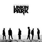
 The cover appeals to
the target audience as the style used, such as silhouettes and the use of
simple blacks and whites is similar to those of artists like Linkin Park, who’s
later albums use a lot of the aforementioned features, whilst the use of simple
bars to outline the text is reminiscent of 30 Seconds To Mars’ third album, This Is War.
 The use of imagery and
fonts of Asian origin/inspiration was my own idea, as I wanted to add a more
exotic element to the products than I had in previous instances.
Although the client
commented on the album cover, they also pointed out the fact that there was no
spine or back cover, which both had to be worked on before my final deadline.
Apart from this, the
client commented on the cleanness of the album cover.
The products are aimed
at people who listen to post-grunge and Nu Metal, and are identified as such by
the album’s unusual title and the titles of the songs.
The promotional poster
was based off a tour poster by 30 Seconds To Mars, though this was mostly in
the layout, with the font and imagery bearing the more exotic themes mentioned
above.
The client mentioned
the spacing, and how the product would be better balanced if the text and
imagery of the album cover were moved to the bottom of the poster, instead of
being spread in a haphazard manner.
The client also
suggested moving the record company logos to a place where they would be out of
the way, as well as decreasing the size.
Again, this had to be
done before the final deadline.
 As with the album
cover, the promotional poster’s cleanliness was commented on, with the client
stating that the stark contrast and empty space of the black & white
created a feeling of something new and different, which hadn’t been apparent in
the previous albums.
The final, and perhaps
the most difficult product, was the Onesheet, which is by far the most detailed
part of the production so far.
The client was pleased
with the overall layout of the Onesheet, which included the details of the band’s
past and success, the total length of the album, the cover art, the release
date, the track listing and the band’s website address.
The client’s only
worry was of how the text was displayed, as there was very little spacing and
not much room for the text to ‘breathe’.
The client suggested
reducing the leading so that the text was more spaced, as well as reducing the
font size.
The main reason why
this product was the hardest to design was because I could find no Onesheets
used by the artists that I was taking inspiration from.
To this end I had to
improvise, using Onesheets made by amateur artists, as well as one I designed
in a previous unit, to create a product that looked both realistic and
enticing.
As a general rule, I responded
to the client by carrying out the suggested alterations, as for the most part
the client knew what was wrong and how to fix it, however, I did make a few
small alterations of my own to make the products a little more appealing,
rather than just ordered.
For the most part, I
used Photoshop as a common tool, as the necessary techniques I needed were
easily accessible and I was familiar with the software.
Using Photoshop made
the products easy to edit and experiment with, providing for simple alterations
to achieve the best effects.
As far as improvements
go, It is hard to think of any that have not already been brought up by the
client.
One possible
alteration for the Onesheet could be to make the overall product slightly
larger. This would allow for more spacing in the text and for the font to the
slightly larger, making it more readable.
Overall, the client
was satisfied with the work and the production was deemed a success, both by
the client and those involved.
No comments:
Post a Comment